Improving Your Digital Presence is an Adventure. Let us guide you through it.
Contact us using the form below and one of our team members will reach out as soon as possible

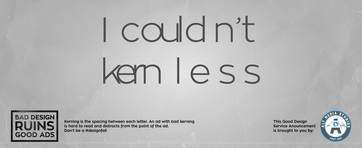
Have you ever looked at an ad and been completely distracted by the error you noticed? Bad color choices, hard to read type, a blurry image, or maybe some weird spacing between the letters? After all the time and attention put into making this ad that's supposed to impress potential customers nothing could be worse than a glaring design error that sticks out like a sore thumb. Think anyone's going to take your ad seriously when it has such a bad design?
Request a Graphic Design Quote
Don't fall victom to bad design, but let a professional (like us!) create the perfect digital or print ad for you.
This month's #designfail to avoid: bad kerning. Kerning is the spacing between each individual letter. Most of the time our fonts do a good job of taking care of the kerning, but sometimes there's a letter here or there that looks too close or too far away from the one next to it. The kerning for that letter needs to be fixed so visually the spacing between each letter looks correct. But sometimes people go overboard with kerning and end up with letters way too close together or too far apart. The result is a mess of letters that can be hard to read and completely distracting from the point of the ad. Don't let bad kerning happen to your ads!
Contact us using the form below and one of our team members will reach out as soon as possible
Web DevelopmentDigital MarketingBrand DesignNews & ResourcesAboutMeet the TeamLocationContact Client Portal Leave us a review Privacy Policy
PO Box 23483
Chagrin Falls, Ohio 44022
Phone: (440) 777-6666
info@amst.com
All Rights Reserved 2025, Alt Media Studios
Admin Login »